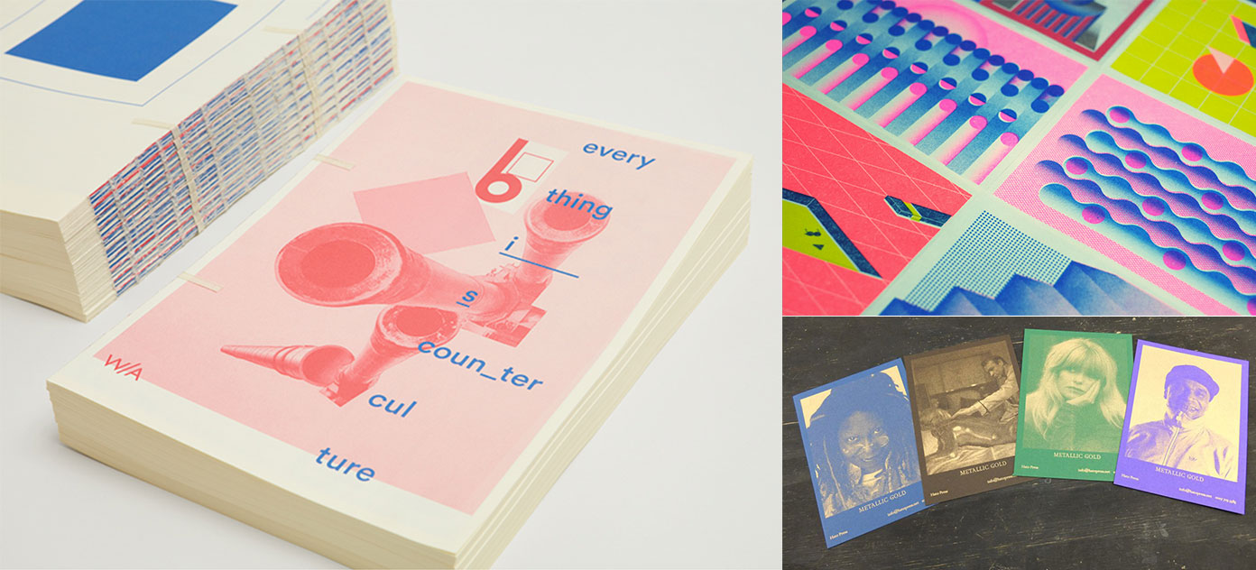
Riso printing, what?

To put it simply, it’s a printing machine that projects a digital stencil onto the drum (which has a specific colour), the paper passes through the drum imprinting the stencil onto it. It does this one drum (colour) at a time. The results are somewhere in between screen printing and lithograph.
The final aesthetics are bold, especially with flat colours.

So where did it originate from?
Its origins trace back to the 1980s in Japan, the printer was developed by a company called Riso, for high speed printing and high volume photocopying. Over the years it was adopted for high turn around printed pieces for churches and schools. But recently it’s been snapped up by creatives, designers and artists because the of the vibrant colours it produces.
What’s special about it?
The main reason for the rise in riso is down to the cost. It’s cheap, well, compared to its rivals. What excites me is Riso printers don’t use CMYK colours, they’re limited to a bunch of commercially used colours (SPOT colours to be exact), which trumps digital printers, which are limited to CMYK. And the colours that are used are exciting, gold and fluorescent pink and orange to name a couple.
It’s not perfect either, mis-registration can happen and an image with too much colour can make the colour more intense. But, these are happy accidents, they add character in my eyes.
These colours are what makes Riso prints stand out from the crowd, they add vibrancy, combined with an uncoated stock (because Riso printers can only print on uncoated stocks) it will create a unique finish every time.
So, next time you’re out and about and you notice a vibrant textured poster, chances are it’s been printed by a Riso printer. Then you can boast to your friends about your print knowledge.
Keep your eyes peeled for other blogs on printing techniques.