Work that really makes a difference
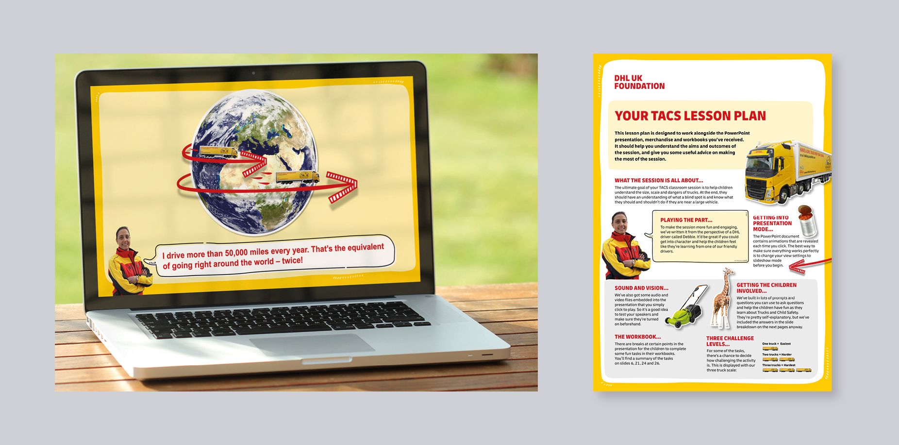
The final part of our task was to create a new digital tool for schools to use in Trucks and Child Safety (TACS) sessions, which due to the COVID-19 situation, needed to be delivered virtually.
Playful illustrations with hard-working UX design
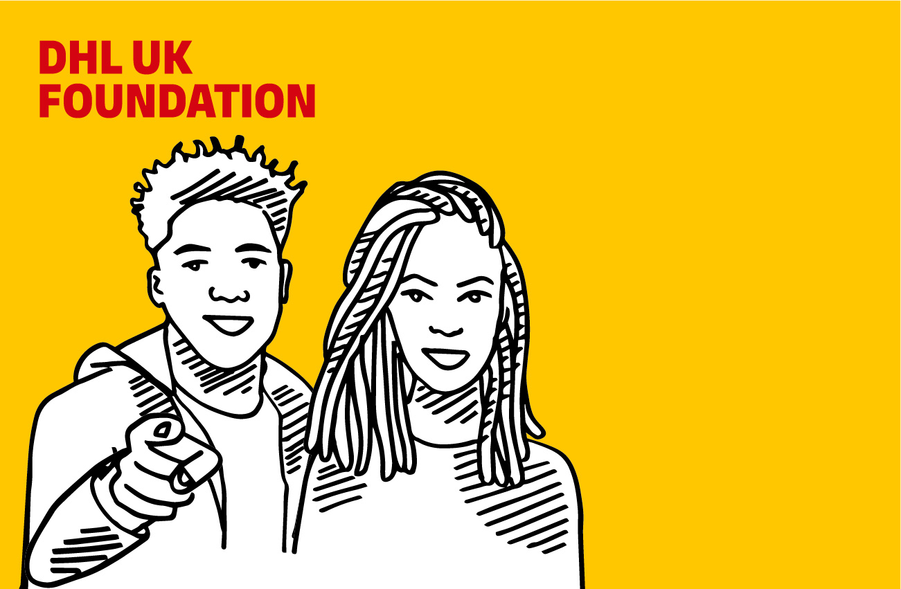
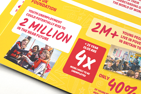
We took an audience-first approach to redesigning and rewriting the website, mapping out user journeys to make sure we told the story in an engaging and enjoyable way. But we knew it would take more than intelligent design and welcoming copy to really capture the friendly, positive personality of the DHL UK Foundation team. So, we injected a little fun into the brand with light-hearted illustrations that serve to remove the corporate edge and replace it with a smile.
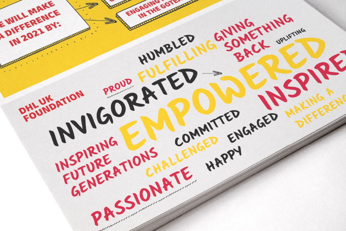
We’ve successfully rolled out the refreshed brand well beyond the website with print and video, as well as taking it into classrooms with TACS virtual lesson toolkits.
A re-design that connects people and purpose
We helped the DHL UK Foundation modernise its brand, lift its digital presence and engage young audiences, without losing the warmth and focus that define its mission.Brand refresh with purpose
We developed a distinct, youth-focused brand identity that balanced the charity’s warm, approachable personality with the credibility required to align with the DHL name.A website built for everyone
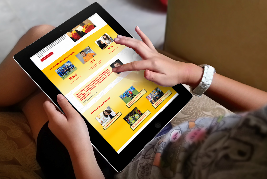
We created a user-friendly platform that meets the needs of partners, educators, and internal teams - making content easy to access, share and update.Bringing learning to life
To support virtual delivery during COVID-19, we designed an engaging digital toolkit for the Trucks and Child Safety (TACS) programme - complete with playful illustrations and thoughtful UX to keep young audiences engaged.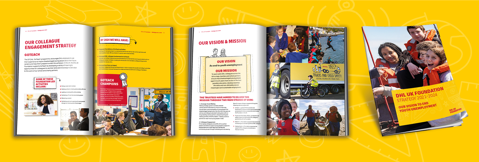
We’re very proud of the work we do every day at DHL UK Foundation. This is why it’s so important to us that our brand and website can communicate our goals, our vision and our purpose in just the right way. So, we needed a partner who cared about getting to know us and was committed to creating work that really does our organisation justice.
This is exactly what we got from Upp B2B. They worked closely with us at every step of the journey, using their strategic expertise, technical knowledge and boundless creativity to design and build a website that partners, schools and colleagues love.
Check out other work
Actions speak louder than words. And tangible business results speak even louder. So, please take a look at some of the organisations we've helped transform with impactful branding, strategic thinking, websites, campaigns and all kinds of activations.